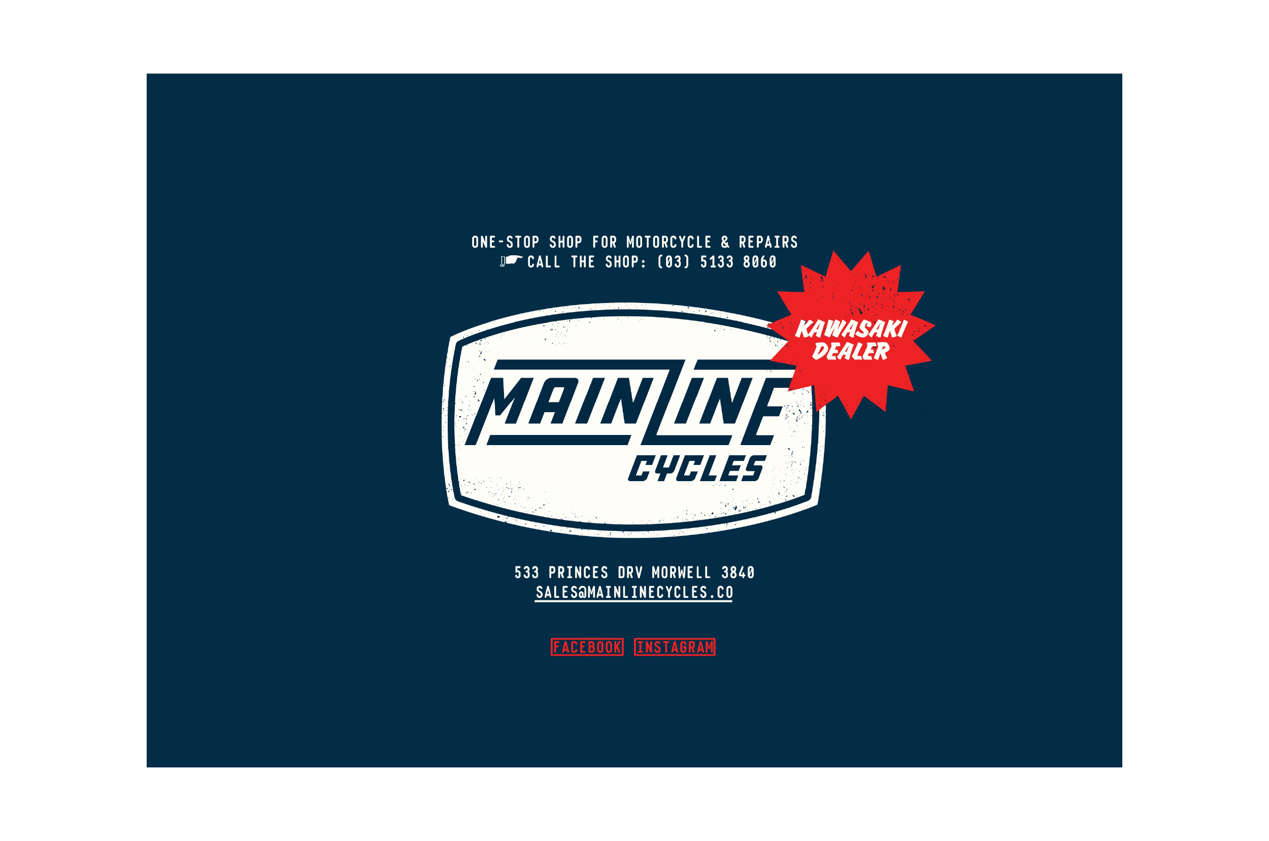
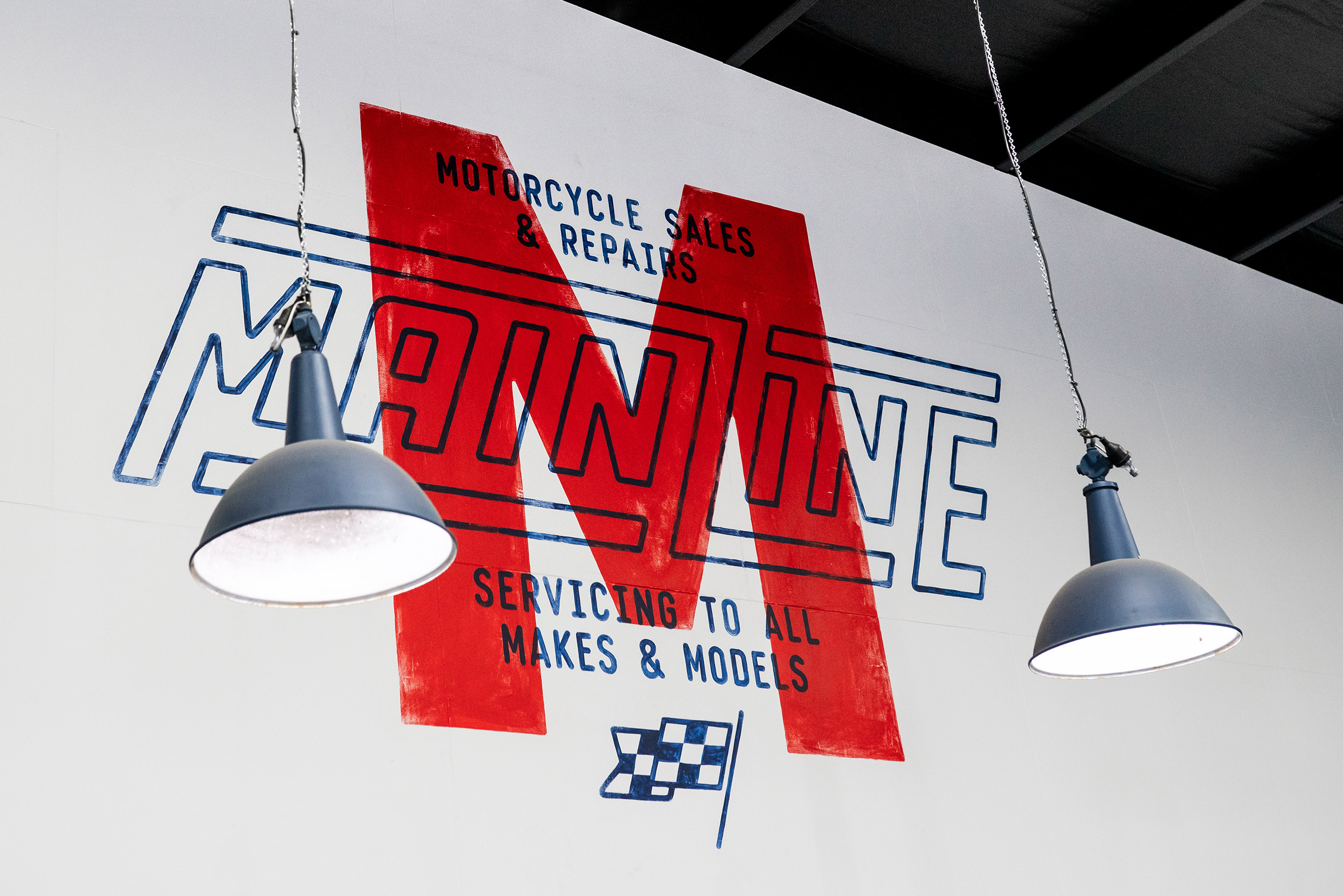
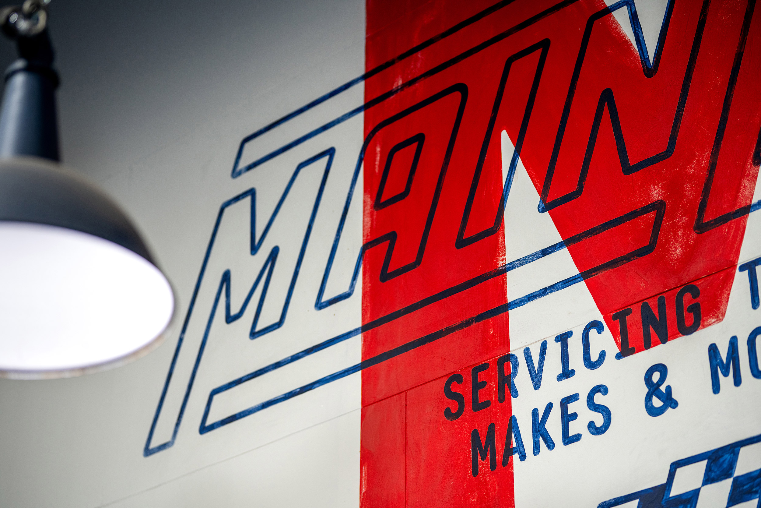
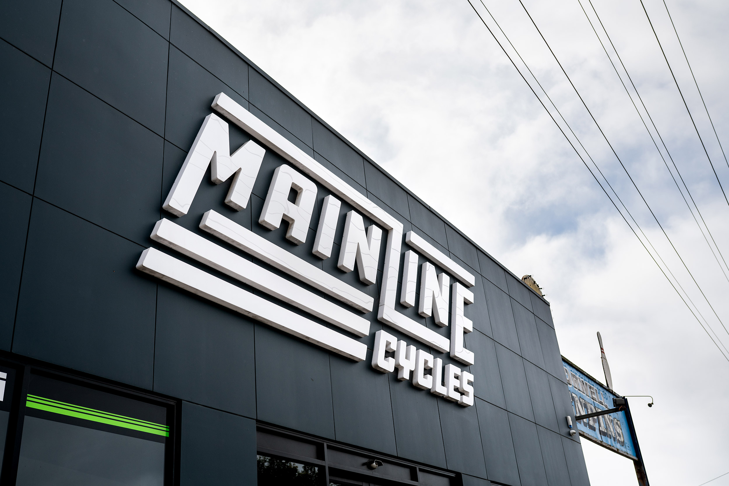
We worked with Mainline Cycles to develop a brand identity system inspired by the authenticity of motorcycle culture while not explicitly tailored to a particular era or bike style.
Mainline service and repair all motorcycles, no matter the make or model. Their audience is broad and wide-reaching; they come from various age groups and interests, but they’re all seekers of adventure and friends of the road, bound by a love of bikes.
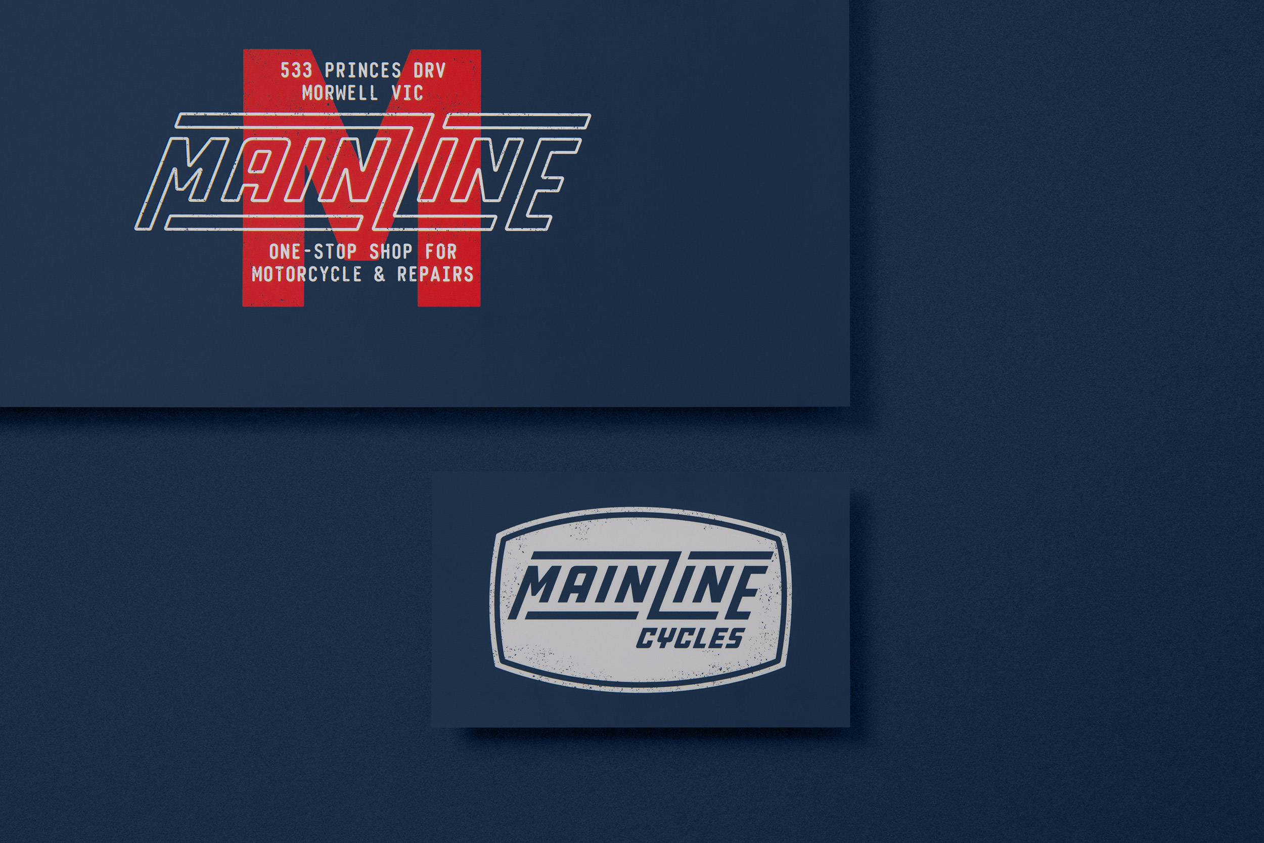
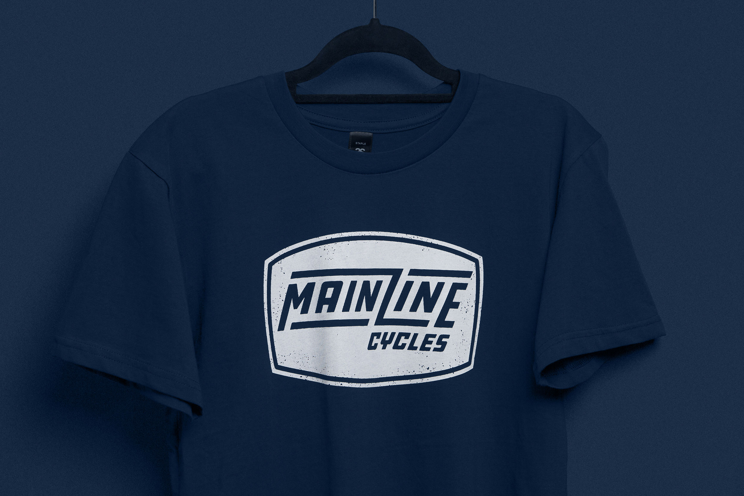
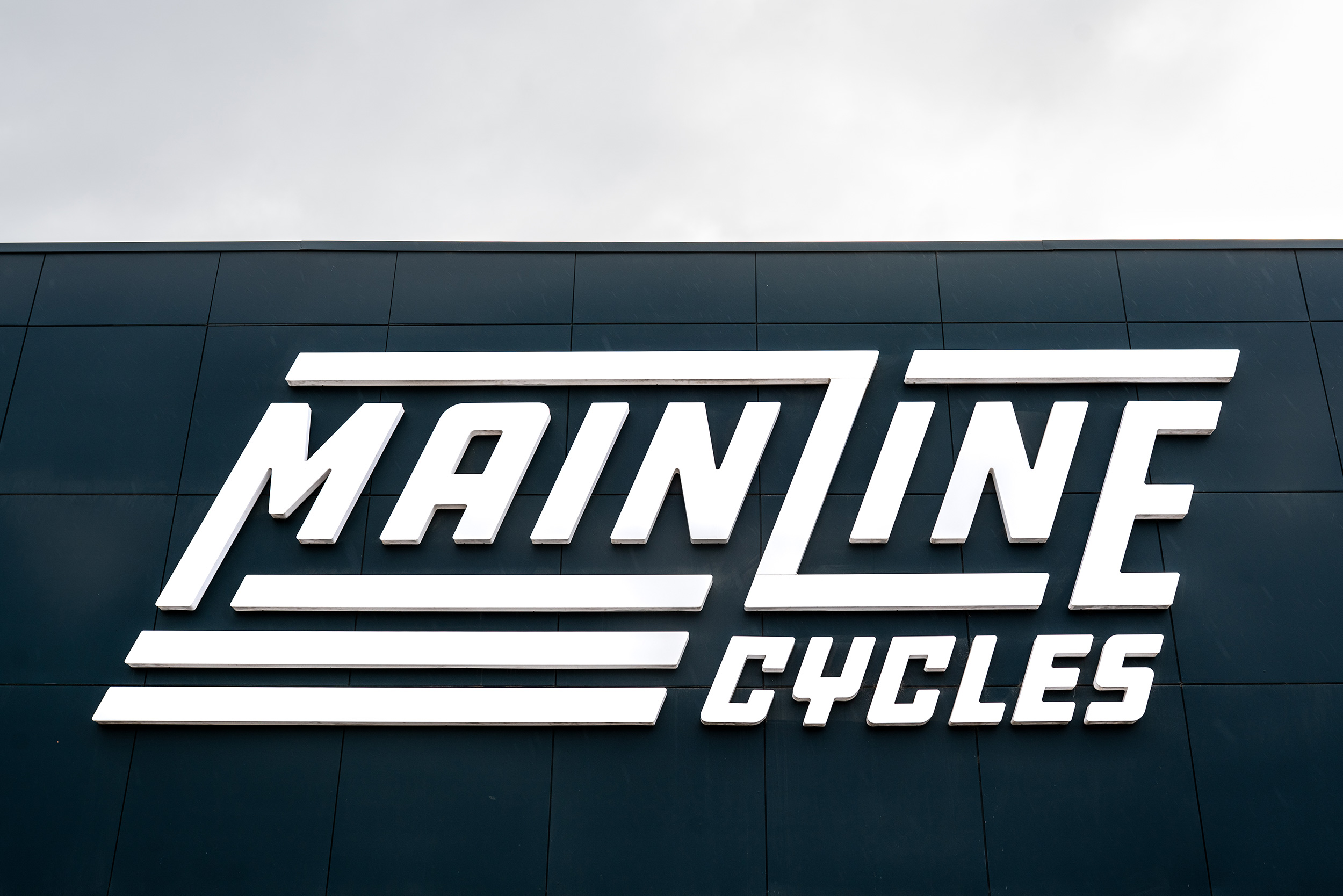
We developed a language that highlights the Mainline in-shop experience as a ‘one-stop-shop’ for services and repairs to all motorcycle makes and models. We designed several bold, high-performance logos featuring a capital letter L that acts as a tribute to ‘life in the fast lane’ and emphasises the word ‘line.’
We designed all print materials, including business cards, gift vouchers, apparel, shop signage, van signage, and digitally – a website landing page.